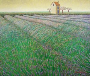
The Christina Gallery

On the Island of Martha’s Vineyard

  • Art
    • Artists
    • Original Paintings
    • Mini Boats
    • Modern Masters Collection
    • French Fashion Prints
    • Botanicals
    • Sailors Valentines
    • Burgees
    • Hand Colored Engravings
    • Watercolors
    • Prints
  • Maps
    • Cartographers
    • Massachusetts
    • New England
    • New York
    • World Maps
    • All Map Areas
  • On Sale
    • Original Paintings
    • Modern Masters Collection
    • Maps on Sale
    • Nautical Charts on Sale
    • Limited Edition Prints

The Christina Gallery

  • Tour
  • News & Blog
  • About

News & Blog

Antique Maps: A View into the Political and Social Landscape of the Past

Here at The Christina Gallery we carry a vast collection of antique maps dating back to the late 16th century and nautical charts from the 19th century. Map making has always been an important part of the history of modern society. A map conveys much more than geographic information. From antique maps we are able to rediscover the world of our ancestors and understand the interactions between different cultures, countries and empires based on the images they produced and their depictions of foreign lands.

The earliest known maps date back to the Babylonians in 3500 BCE, but it wasn’t until the invention of the printing press in the middle of the 15th century that maps were mass produced and became popular with the general public. Scientific methods of measurement were introduced to cartography in the 17th, 18th and 19th centuries. Many of the maps on display at The Christina Gallery were printed from a metal plate then colored by hand.

Novi Belgii (1671) provides an interesting window into the political environment of the 17th century. This striking map portrays the English-dominated regions of New England and includes every settlement and river along the coastline. The cartographer, Arnoldus Montanus (1625 – 1683), was a prominent Dutch minister, teacher, author, and publisher in the seventeenth century. His rendition of the New England topography has been accepted as the standard by which the Dutch understanding of the New World can be assessed, despite the fact that Montanus himself never actually visited New England. It was considered common practice for cartographers to use each other’s work as source material when creating new maps. His portrayal of New England was based on the influential mid-17th century Jansson-Visscher series of the same subject (Jansson and Visscher were also Dutch cartographers).

Novi Belgii by Arnoldus Montanus
“Novi Belgii” by Arnoldus Montanus

This particular map is remarkable because of its elaborate cartouche adorning the bottom right of the plate. Montanus has carved seven figures into the copper plate from which his map was printed, along with numerous flora and fauna. The figures shown in the title cartouche are performing several different occupations undertaken by the settlers and the natives such as hunting and trading. The interior of the map is elaborately engraved with miniature trees, rivers and indigenous animals throughout the entire image.

At the time of this map’s creation the British and Dutch governments were struggling over the ownership of land in North America. Montanus clearly declares the terrain as “Novi Belgii,” or “New Netherland” in his depiction of the newly acquired land. This bold claim provides interesting insight into the political landscape of the time. Dutch mapmakers were known for their highly-skilled work and engraving capabilities. English mapmakers were unable to compete in this department leaving Dutch cartographers to dominate the map market, and thus attempt to mark their territory through text. This allowed the Dutch government to use maps such as Montanus’ Novi Belgii as powerful propaganda tool in asserting their ownership of “New Netherland.” Montanus’ map has left us a record of the expanding reach of European powers upon the New World.

Visit us at The Christina Gallery in Edgartown, MA to see our full collection of antique maps and nautical charts or view part of our collection online here.

An Interview with John C. Traynor

This past week John Traynor visited Martha’s Vineyard. I was able to steal him away from painting for a short while in order to talk to him about his artwork. Traynor has had a successful career as an artist, commemorated by over 200 awards. Read on to hear about John’s affinity for the Vineyard and his inherent ability to capture the splendor of nature.

By Erica Udow, Gallery Associate

You have been visiting Martha’s Vineyard in the summertime for many years. What is it that attracts you to the island?

I like the peacefulness of Martha’s Vineyard. Of course, the past couple of days have been nice with the sunny weather and the light breeze. Like many visitors to the island, I come near the water and immediately relax.

Do you have any favorite spots to go and paint?

I used to like painting Menemsha, but a little bit of the old world feeling is going away. I like the variety of the different towns. We usually go for breakfast out by Gay Head near the Indian Reservation. It’s nice having come here for a while, to have our favorite places that we go back to time and time again.

On the East Coast everyday is different. If you own a house here you can sit in the same spot at the same time each day and see a completely different landscape with a different sky reflecting into the water. That phenomenon is unique to this area. I spent some time traveling on the West Coast this year and was able to experience and paint some striking landscapes in Hawaii and Carmel, California. There are varied landscapes in those areas, but the sky doesn’t change in the same way as it does along the East Coast.

Last summer the theme of your exhibition at The Christina Gallery was “Favorite Places,” based on your travels around Europe. What themes are you developing for next summer’s exhibition?

This trip I’m getting things together. I’ll have some local Vineyard scenes for the exhibition next year. I’ve never been here in August before. We usually visit in July so I’m absorbing different scenery and changes in the landscape. I will be back here next summer when the roses are out; hopefully I’ll include those paintings in the show. I tend to let themes emerge naturally, so I’ll have a better idea of what the exhibition will look like by the spring [2013]. Until then, I will paint whatever inspires me. I have recently become more interested in figurative painting. This trip to the Vineyard I have spent time paying attention to the way people interact and taking photographs when people catch my eye. I’m always thinking about how to improve my paintings.

Is most of your current work done on location or in the studio?

I spend a lot of time painting outside on location. If you’re out for a couple of hours things happen. You meet people. Being outside you have the smells and the sounds…other senses to go by.

When I look at your artwork I’m immediately drawn to the way you are able to depict natural light. Your paintings seem to glow from within and the way sun breaks through the clouds in a natural, graceful way.

When I paint outside, that’s the first thing I think about – the light. The light changes in about an hour to an hour and a half so I try to work quickly within that time frame before the light changes drastically. When painting I learned to use light to help the viewers’ eye move around the painting. Painters that I like from the past do that really well. For me capturing the light is about capturing the feeling of the moment and the scene. I want to share that feeling with the viewer and help them experience my painting with all of their senses.

What artists inspire your approach to depicting light?

Old masters like Rembrandt and more modern artists like George Ennis, who was part of the nineteenth century Hudson River School. As I developed my own painting I became interested in the moment when Impressionism came to America. Frederick Mulhaupt of the Gloucester School was an interesting artist. He was able to capture the complete ambiance of a scene in each painting. I try to do the same in each of my works.

Do you ever paint alongside other artists or do you prefer to work alone?

A lot of the trips I go on, I really just want to paint. Once in awhile I go out with someone else and paint together, but for the most part I work alone.

What is the intention behind your paintings? Clearly, there is a focus on the portrayal of light, but are you also trying to impart a message upon your viewers?

I interpret what I look at; that’s what I want to pass on to the viewer – the beauty of nature and the implications of light. People have told me that they look at my artwork and are immediately able to relax. Today everything is mechanical. When someone has something that is made without technology it is really special. I want to leave my viewers with something honest. I want to share what I see; the spontaneity, the structure and the beauty of what is all around us.

You can find more information about Traynor’s Summer 2011 exhibition, “Favorite Places,” at The Christina Gallery here.

John Powell’s Visions of Paradise

John Powell is a bold artist. He doesn’t shy away from color or detail as is so clearly evidenced in any one of his oil paintings. Powell has an uncanny ability to meld reality with fantasy to create lush landscapes and ornate still-life’s. Perhaps his interpretation of the world comes from his Hollywood roots; John Powell grew up in Hollywood, California. As a young man Powell joined the Navy for a four year stint. Two of those years were spent based in Japan where he developed a deep-seeded interest in the Far East and Japanese culture. Throughout his life Powell has continued to travel and collect objects from around the world. These artifacts feature prominently in his paintings.

"Window Nook" by John Powell
“Window Nook” by John Powell

Powell’s steady hand and vivid imagination lead to incredibly detailed images, both in the foreground and background. Not a single blade of grass or curlicue design on a Japanese vase escapes Powell’s grasp. Incredibly, this inundation of information does not overwhelm the viewer, but rather heightens one’s senses. The viewer is drawn into the scene and soaks up every detail. Nothing escapes Powell’s observant eye. In “Window Nook” we see no fewer than six different vases, four tables, and three ornate textiles portrayed. Those objects only begin to make up the background of painting. The true subject of the painting is the vibrant flowers that seem to grow out of the canvas, blooming in every inch of the artwork.

Powell has often spoken of his intense interest in color that drove him to pursue painting. “I was on a bus going home to Hollywood. The evening was warm and the shadows were strong. Suddenly it hit me – there they were; all the colors my father and Will were talking about.” His father, a respected Californian artist, taught Powell to draw but wouldn’t allow him to paint until he had learned the basics and first became an accomplished draftsman.

At the age of 82, John Powell is still expanding his oeuvre and developing new techniques. Speaking about a recently completed large-scale work “’This was a first for me as far as painting a triptych this size. It presented new challenges as well as new goals and growth for me as an artist.” Not only did Powell tackle an enormous project (the completed work stands at 15’ high and 3’ wide), but the underwater subject was also a departure from the garden-scapes for which he is known. Many of John Powell’s new paintings are currently on display at The Christina Gallery. Come visit us in Edgartown to see these elaborate artworks yourself.

An Art Nouveau Calendar

Art Nouveau, although short-lived, defined the social landscape of turn of the century Europe. The movement sought to socialize all art forms, viewing crafts and decorative arts as equally valuable to what has historically been known as ‘high art,’ painting and sculpture. Artists working within the style created modern motifs blending organic curvilinear shapes with angular designs. Art Nouveau can be seen as a rejection of the ornate art celebrated in the Victorian-era and the patronizing academic attitude often credited for the decline in the prestige of decorative art.

In 1894 the French department store La Belle Jardinière commissioned Grasset to complete a series of twelve original artworks for a calendar the fashionable retailer would then publish. In twelve iterations corresponding to each calendar month, Grasset depicts beautiful young women in seasonal costumes and gardens that incorporate his signature Art Nouveau style into whimsical color wood engravings. In “Octobre” a woman is shown raking leaves in an autumn garden full of green, yellow and brown foliage. Despite partaking in yard work the woman is elegantly dressed, advertising La Belle Jardinière. She wears a long-sleeved yellow dress and a wide brimmed hat protecting her from the elements; her skirt is blowing in the breeze.

"Octobre"
“Octobre”

Eugène Grasset’s diverse body of work exemplifies the attempt to eliminate the hierarchy of the arts. Best known for his poster art, his career spanned a multitude of different media including drawing, sculpture, architecture, tapestry, ceramics and jewelry-making. Grasset approached each endeavor with the same enthusiasm and did not discriminate against lesser-appreciated craft-art. The 19th century had been a time of great industrial achievement yet the quality and workmanship of decorative arts was not yet up to par. Grasset, and other Art Nouveau artists, returned the skill to craft-making.

All twelve images can be seen here and at The Christina Gallery. Read more of Eugène Grasset’s biography here.

An “Evening of Fine Art” with Marjorie Mason & Sandi Blanda

This upcoming Thursday evening, August 9th, will be the second “Evening of Fine Art” of the summer 2012 season. Here at The Christina Gallery we will be featuring the work of island favorite, Marjorie Mason. Mason has developed an impressive following of patrons since her graduation from the prestigious Rhode Island School of Art and Design in 1981. Her body of work is composed mainly of beach and landscapes from around the Vineyard.

Sailors’ Valentines by award-winning artist Sandi Blanda will also be highlighted during the evening stroll. Read more about the maritime history of Sailor’s Valentines here. Blanda will be running her annual workshop from August 7 – 10, 2012.

"Crimson Tide" by Sandi Blanda
“Crimson Tide” by Sandi Blanda

Join us at The Christina Gallery from 6 to 8pm on Thursday August 9th as we open our doors to the public for the opening reception for Marjorie Mason and Sandi Blanda. We look forward to seeing you here!

A Look Back in Time: Historic Marine Scenes

William R. Davis has made his name as a painter of historic sea and landscapes. Known as one of the best marine painters of our time, Davis is a self-taught artist who learned to paint by studying the works of 19th century masters. Francis Silva’s works showed Davis that warm tones are pleasing to the eye, while astute observation of William Bradford’s paintings led to Davis’ technique of priming his canvas in salmon hues. The salmon under-painting results in the warm glow that marks each of Davis’ oil paintings.

"Gay Head Light c. 1890" by William R. Davis
“Gay Head Light c. 1890” by William R. Davis

Davis was born in 1952 in Somerville, MA and grew up near the water in Hyannis where he developed a love of sailing that would last a lifetime. He has amassed a library of over one thousand texts on marine artists, historic vessels, maritime charts, and other boating related books. He thoroughly researches each landscape in order to recreate its 19th century appearance. Davis uses a gentle hand and a soft sable brush to create his carefully rendered oil paintings. His works are defined by their warm color palette, impeccably detailed subject matter, smooth surface, and atmospheric lighting. Renowned for his ability to accurately portray the billowing sheets and taught lines of a schooner, he is also unmatched in his ability to emulate the quality of light in a dewy sunrise or a pink-tinged sunset. His perceptive appreciation of light allows him to capture the power of nature in every painting. Collectors of Davis’ art praise the elegant way his brushstrokes melt into the surface of the canvas and the accuracy with which he captures the turn-of-the-century seascapes.

William R. Davis’ work is reminiscent of the American Luminism of the late eighteen hundreds. The style is defined by the use of natural light, often sunrise or sunset, in the paintings of American landscapes. Davis’ work can be found in collections and exhibitions around the world, including at The Christina Gallery in Edgartown, Martha’s Vineyard.

Lillia Frantin: A Contemporary Modernist

Walking past the windows of The Christina Gallery, one can’t help but notice the bright colors and bold brushstrokes of Lillia Frantin’s “Still Life on a Summer Day.” The large canvas radiates energy while Frantin’s palette of pastel and neon shades illuminates space far beyond the painting’s frame. A bouquet of pink flowers blooms in a glass vase. Green stems create contrast with the orange and yellow backdrop of the painting, and the plate of oranges at the foot of the floral arrangement.

"Still Life on a Summer Day" by Lillia Frantin
“Still Life on a Summer Day” by Lillia Frantin

Lillia Frantin’s influence by Expressionists and Fauvists such as Matisse, Cezanne, and Bonnard is clear. Like her precursors, she tests the limits of representation in her signature loosely painted, energetic still lifes. After teaching Modernist Art History at the university level for twenty years Frantin retired to pursue her painting career full-time. Looking at Frantin’s paintings is like seeing the world through her eyes. As she describes “…Art is really what we all search for in life: understanding and respect, harmony and freedom, connection, vitality, truth and beauty.”

The Christina Gallery welcomes Lillia Frantin’s Modernist oil paintings back after a ten-year hiatus. Her work can be found in collections across the United States and abroad. Come visit us at the gallery and ask us for more information or to see her vibrant works yourself.


The First Gallery Stroll and an Interview with Lloyd Kelly

Last night’s reception of Lloyd Kelly’s “Paintings of Provence” coincided with the first Gallery Stroll of Summer 2012. The gallery was filled with visitors from all sides of the island. Guests enjoyed drinks and conversation while looking at paintings by artists such as William Davis, John Traynor, Russell Gordon, Lillia Frantin and four generations of the Pissarro family.

After viewing “Paintings of Provence,” I was able to enjoy a conversation with the artist Lloyd Kelly. He talked candidly about his inspiration for the show, his approach to painting in general, and his interest in the Far East. – Erica Udow, Gallery Associate, The Christina Gallery

An Interview with Lloyd:

The theme of this exhibition is Provence, France. Many artists in history have embraced this subject. What inspired you to continue the tradition?

“Impressionists called themselves Japanesists because they were so influenced by the Japanese. The South of France is inspirational because of the food, the wine…magic light there. It is still a big influence on artists today. There is such diversity of landscape; nature is so present. It energizes the artist and inspires…”

Speaking of inspiration, you have spoken of the influence the eighteenth century Japanese artist Ito Jakuchu has had on your work. How did that develop?

“First of all through textbooks and also through my interest in martial arts and Tai Chi starting as a child. My father was in the military and travelled to Japan. Because of things that my father brought back, I started becoming more and more interested in China and Japan.”

What about Jakuchu’s work appeals to you?

“The specific influence of Ito is that he incorporates asymmetric balance that for the time was very unique. He really is arguably one of the greatest artists of all time.”

Are there other artists whose work you find to be particularly influential?

“Do you know the artist Morandi? Giorgio Morandi was from Bologna. He was very influential on people like Rothko. You name the big artist and they were all looking towards Morandi. He has always been an artist’s artist. He takes very simple objects that are conventional so that [the object], be it landscape or still life, is not about the subject matter at all, it just becomes a way into the subject matter.”

In “Arts & Ideas” you mention that your work is abstract and not only about the obvious subject matter of the painting. Is Morandi’s approach what you are referring to?”

“For example the Chinese and Japanese will paint the same peach blossom for generations. It is not about the peach blossom [itself], but what each artist brings to the peach blossom. Morandi lived with his mother and painted the same objects over and over…dealing with abstract and contemporary issues… moving around space, and color. [He made] the subject matter accessible to the viewer. It is really about something else even though the subject matter is traditional and conventional.”

I read about your use of bourbon as paint thinner in a series of equestrian portraits you painted a few years ago. Have you continued to use this technique in your recent works, or was that an one-off experiment?

“I use lavender oil in the paint. Sometimes, in fact, the UPS people will ask ‘what is this I have in my truck!’ Spike of lavender was used during the Renaissance… It causes the paint to flow. It slows down the drying and one can really draw with the paint. I use it in small passages, often in the lavender blossoms themselves. I sometimes use bourbon or cognac or calvados. I go to the distilleries and they give me the designate, which is completely clear, and does not contain the chemicals and tannins and so forth. It disperses the pigments differently than chemical mediums.”

How did you come up with the idea to use unconventional mediums?

“After school I [completed coursework in] Museum Studies at The Louvre and The Tate. I collected [indigenous materials]. I think it is fun. I think it’s interesting. There’s some sort of an authenticity to it. It is kind of like living off the land. I think that the source is from my museum education at the Louvre.”

Your oil paintings demonstrate an adept ability to manipulate color…

“You can only get about 170 colors [readymade from an art store]. The human eye, untrained, can see up to 700 with no problem. With a little training [it] can see up to a few thousand. The interaction of colors is something that interests me a lot. That is why I do so much under painting. The viewer’s eye mixes the colors. The colors that I mix are [just the first step in creating the final product]. The viewer’s eye brings it together to another place.”


Four Generations: Camille Pissarro & Family

Born on the island of St. Thomas in 1830, Camille Pissarro became a master of the Impressionist movement whose influence extended to not only his contemporaries in Paris, where his career blossomed, but also to his own immediate family. Pissarro learned to paint by carefully observing the changing light during different times of day and different seasons, a legacy he passed on to all those who studied under him.

Of Pissarro’s seven children, four of his sons grew to be respected artists in their own right; Lucien, Ludovic-Rodo, Georges Henri and Paulémile. Lucien, the eldest, was skilled in a variety of media, ranging from oils and watercolors to engravings and lithographs. Aside from studying under his father, he also surrounded himself with such figures as Paul Signac and Georges Seurat. The pointillist style practiced by these two masters affected Lucien’s style, as well as his father’s.

Pissarro with his wife and son, Paulemile, and daughter, Jeanne in their garden at Eragny in 1897

Though Lucien eventually moved to London permanently, playing a large role in spreading the Impressionist movement in Britain, the majority of Camille’s other artistic protégés remained closer to home. Georges Henri, who went by the alias “Manzana” in his earlier years, was a prolific painter and decorative artist who regularly exhibited paintings in the avant-garde galleries and exhibitions across Paris, including but not limited to the “Salon d’Automne” and the “Salon de Independents.”

Georges Henri’s next closest brother, Ludovic-Rodo, was a figure in the anti-academic Parisian art world; his first woodcuts were published in the anarchist journal Le Pere Peunard. Rodo and the youngest Pissarro brother, Paulémile, lived in the Montmarte region and frequented the nightlife and cafe scene there, coming into contact with such Fauvists as Maurice Vlaminck, Kees Van Dongen and Raoul Dufy.

Paulémile’s oldest child, Hugues Claude, who was named after his godfather, Claude Monet, was born in 1935 and is still actively painting. Initially taught by his father, Hugues first exhibited his work at the age of fourteen. He subsequently studied art in Paris at prestigious establishments such as Ecole du Musée du Louvre and, in particular, at Ecole Normale Supérieur, a unique French institution dedicated to the pursuit of achievement and excellence to which only the academic elite have access. Hugues youngest child, Lélia was born in 1963. She has been painting since she was four and was educated by her grandfather, Paulémile. Her interest in drawing and painting was nurtured by her grandfather, who taught her the fundamental impressionist and post-impressionist techniques.


“Paintings of Provence” by Lloyd Kelly

Lloyd Kelly is internationally renowned for his landscape and equestrian oil paintings. He has exhibited at The Christina Gallery since 1994 as well as at galleries and museums around the world including the United States, Mexico, Japan, China, France and Italy.

"Juillet en Provence" by Lloyd Kelly
“Juillet en Provence” by Lloyd Kelly

Kelly’s works are often celebrated for their bold use of color and unique asymmetrical balance. High horizon lines simultaneously provide the viewer with both an interesting focal point and an entryway into the canvas. Diagonal lines extend off the canvas out into the viewers’ space, resulting in the dissolution of barriers between reality and the world created by the artist’s brush. This technique allows the viewer to become a part of the painting.

A consistent thread seen in Kelly’s work throughout his career is his use of complementary colors in the fore and background of his paintings. He places great importance on the under-painting of his canvases. The contrast that his layering creates adds dramatic tension to the deceivingly simple compositions and subjects. His selection of beautiful and serene subjects such as lush lavender fields and floral still-lifes are familiar to viewers. Kelly himself frequently reminds the viewer that his work is abstract and that diverse and unexpected meaning can be found in even the most seemingly innocuous subject matters. The painting is not only about the object itself; conventional subjects become a way to express other ideas.

From July 5-19, 2012 The Christina Gallery will have on view an exhibition of original oil paintings by Lloyd Kelly entitled “Paintings of Provence.” Inspiration for the works in this show comes from Kelly’s travels to the south of France. Many master painters in history are either from, or travelled to, Provence. The rolling hills, impressive architecture and surreal natural lighting provide a rich subject matter for this collection of paintings. As Kelly explains, “The south of France is inspirational because of the food, the wine, and the magic light there. It is still a big influence on artists today. There is such a rich diversity of landscape; nature is so present. It energizes the artist and inspires…”

We hope to see you at The Christina Gallery for our first show of the 2012 Summer Season!

February 2012 – Our trip to Paris

Bonjour! As I mentioned in the last blog we would be traveling to Paris in the early part of February to visit with colleagues who handle modern master works on paper. It was a very successful trip and we enjoyed our time there, even though it was unseasonably cold. It seems all of Europe is enduring some very cold weather of late.

We stayed on Ile St. Louis which is very quaint with its wonderful array of cafes, boutiques, patisseries and speciality markets. My parents were surprised with a visit by my brother, Matthew and his friend Stuart. Matthew will be starting a new position as Vice-President of Strategic Planning for Children’s Hospital of Philadelphia, so he decided to get away before starting his new job.

The Musée d’Orsay is always a must when we are visiting Paris. On the fifth floor is the museum’s Impressionist Collection which was outstanding. I don’t think I have ever seen this gallery filled with so many paintings, it was if they all came back at once from being out on loan. I could have spent hours in those rooms.

The museum has also made some recent acquisitions, including The Circle of the Rue Royale by James Tissot. This magnificent painting is a group portrait depicting members of a men’s club posh, gathered on a terrace overlooking the Place de la Concorde in Paris, and at the time, gave recognition to Tissot as “one of the most talented painters of his generation.”

"The Circle of the Rue Royale" by James Tissot c. Musee d'Orsay
“The Circle of the Rue Royale” by James Tissot c. Musee d’Orsay

We also visited the Musée Marmottan Monet in the 16 arrondissement to view an exhibition “Henri Edmond Cross and Neo-Impressionism: Seurat to Matisse.” The museum once was a hunting lodge and also has an extensive display of Impressionist works by Monet, Morisot, Pissarro, Degas, Sisley to name just a few, with a wonderful collection of period furniture throughout the museum.

We did purchase several works on paper during our stay, including Printemps and Prodigal Son (suite of four etchings) both by James Tissot, Gants de Suede by James Whistler, La Belle Jardiniere a calendar of images dated 1896 by Eugene Grasset and several other works which will make their way to our website once they are framed.

It’s always nice to come home after being away for awhile, but I certainly could have spent another week in the City of Lights. It really is a magical city!

January 2012 – The Upcoming Season

Happy New Year! We found 2011 to be a very optimistic year for the gallery. The economy is starting to improve and more importantly art patrons are once again purchasing. We want to thank all of you who passed through the gallery this past year, it was a pleasure to work with you, we appreciate your business and we look forward to seeing you again this season.

Last season’s exhibitions featuring four generations of Camille Pissarro’s family was a resounding success, as was “Favorite Places” featuring the work of acclaimed artist John Traynor. Sandi Blanda held her first workshop on Martha’s Vineyard on how to make Sailors’ Valentines. Everyone who took the three day workshop had a wonderful time with her. One of the participants even entered her completed valentine at the Agricultural Fair in August and won second place for her creation! More recently we exhibited at the 15th Annual Boston International Fine Art Show which proved to be a very interesting weekend meeting new clients and catching up with our colleagues.

This can be considered a quiet time on the Vineyard, but we are very busy planning the upcoming season and talking to artists about their works. And we do have artists sending new work now. We received this painting by William R. Davis last week and it’s absolutely stunning!

"Return Sail from Nantucket, Off Great Point" by William R. Davis
“Return Sail from Nantucket, Off Great Point” by William R. Davis

Our website is a current representation of the gallery’s inventory and as new works become available they will be added.

We will be traveling to Paris at the end of this month to see several dealers for our Works on Paper collection. We recently sold La Danse a la Campagne by Pierre-Auguste Renoir and Histoire Ennuyeuse by James Jacques Tissot; and find our collection of works in need of some new acquisitions. This season we again will feature an exhibition of the Works on Paper, which will include the Pissarro family, as well as other notable modern masters.

We also have an exhibition planned for early July with Lloyd Kelly featuring paintings of the French countryside and other interests. Lloyd is a very accomplished artist whose paintings have hung in many of our American embassies abroad, as well as, many private collections in this country. The last exhibition we did with Lloyd was at the National Arts Club in New York City in 2004 so we are very much looking forward to sharing with you his new works this July.

There will be two gallery strolls this summer, the first taking place on Thursday, July 12th and the second on Thursday, August 9th. Sandi Blanda will be back for another Sailors’ Valentine workshop the second week of August. This summer’s workshop will include an advance class for those who took last summer’s workshop.

We will keep you posted on the gallery’s news and happenings throughout the winter. If you find yourself on the Vineyard over the next couple of months please stop by and say hello as we are open year round.

Our best to you and yours and wishing you all a happy and healthy new year!

  • « Previous Page
  • Page 1
  • …
  • Page 4
  • Page 5
  • Page 6
  • Page 7
  • Next Page »

Archives

News

  • Contemporary Paintings
  • Sailors' Valentines
  • Antique Works
  • Antique Nautical Charts and Maps
  • Updates
  • Exhibitions
  • News
  • Blog
The Christina Gallery

The Christina Gallery
5 Winter Street
Edgartown MA 02539
508-627-8794
art@christina.com

  • Facebook
  • Instagram
  • RSS
Sign up for our newsletter!

Header Image
July Afternoon, Edgartown Yacht Club
Copyright 2025 The Christina Gallery Technology by Tenseg