Jules Chéret is universally known as the master of the modern poster. Born in 1836 Paris into a creative family, Chéret had little formal education yet through an apprenticeship he was exposed to the art of lithography. From 1859 to 1866 he moved to London to continue his lithography training. Inspired by British posters and design techniques and the French Rococo style, Chéret applied his knowledge of printmaking towards creating ads promoting cabarets, theaters and other popular social outlets. By the end of his career he had become a major advertising force, working for all manners of clients including beverage companies and the railroads.
From 1895 to 1900, Chéret produced Les Maîtres de l’Affiche, a publication of high-quality smaller-scale iterations of popular posters from Le Belle Époque period by ninety seven top Parisian artists. Each month four lithographs were mailed out to each of the subscribers. On sixteen occasions, an additional ‘special edition’ lithograph would also be included. Today these 256 prints are extremely rare and in high demand with collectors across the globe.
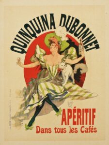
Caption reads: Quinquina Dubonnet / Aperitif available in all cafes.
“Quinquina Dubonnet” is from Les Maitres de l’Affiche. This poster by Chéret is indicative of the style for which he was known. He often portrayed spirited, flirtatious, yet elegant women, who became known as ‘Cherettes.’ These women were neither the prostitutes nor the puritans seen in many works of the time. Chéret’s modern depiction of women was seen as liberating to contemporary Parisian women. “Quinquina Dubonnet” is no exception. Here we see a young socialite sitting with her legs crossed, revealing her ankles, with her arms extended to the sides and her head thrown back in joyous laughter. In one hand she holds a bottle of Dubonnet and in the other, a glass full of the drink. The advertisement reads “Quinquina Dubonnet / Apéritif available in all cafés.” Chéret understood how to get the public’s attention and engage them in advertisements. Editions of this particular print are in collections here at The Christina Gallery as well as in the permanent collection at The Museum of Modern Art in New York.
Check out our website here to view more lithographs from Les Maîtres de l’Affiche or visit us in Edgartown, MA to see them in person!